mat-checkbox uses default material theme colors.
By defualt checkboxes uses the material theme accent color, and we can change it to primary or warn using color property.
And in most of the real world projects we will give our own custom colors to the mat-checkbox and there is no direct way or property though which we can change the mat-checkbox color.
To change mat-checkbox color we need to override the default theme css colors.
Let’s go though an example
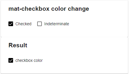
mat-checkbox color
Add a simple checkbox with the label checkbox color.
<mat-checkbox>checkbox color</matcheckbox>
mat-checkbox ouput html
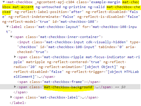
And see the generated HTML for the above checkbox.
mat-checkbox will generate a span element with the class .mat-checkbox-background through which we can control the background color of checkbox.
Now all we have to do is adding background-color css to the .mat-checkbox-background class.
.mat-checkbox-checked.mat-accent .mat-checkbox-background {
  background-color: black !important;
}
And in older versions of Angular we might need to add ::ng-deep as well.
::ng-deep .mat-checkbox-checked.mat-accent .mat-checkbox-background {
  background-color: black !important;
}
mat-checkbox change ripple color
Similarly to change the ripple mat-checkbox ripple color, we need to change the background color of .mat-ripple-element element.
::ng-deep .mat-checkbox-ripple .mat-ripple-element {
  background-color: black !important;
}
mat-checkbox change color of Indeterminate state.
When a mat-checkbox is in indeterminate state, it will have a class named .mat-checkbox-indeterminate
For the checked state we have .mat-checkbox-checked class as explained above.
So we need to change the background color of .mat-checkbox-background element inside of .mat-checkbox-indeterminate.
::ng-deep .mat-checkbox-indeterminate.mat-accent .mat-checkbox-background {
  background-color: black !important;
}
Stackblitz demo
Here is the link to stackblitz demo for mat-checkbox color change.